Redesigning a donation app to reduce drop-off by 50% and build donor trust
Company:
Unify Giving
Timeline:
4 Months
Tools:
Figma
Redesigning a donation app to reduce drop-off by 50% and support fairer giving
Company:
Unify Giving
Timeline:
4 Months
Tool:
Figma

Title
One line to describe the vibe.

Title
One line to describe the vibe.

Title
One line to describe the vibe.
Title
One line to describe the vibe.

Title
One line to describe the vibe.

Title
One line to describe the vibe.
Title
One line to describe the vibe.
Title
One line to describe the vibe.
Title
One line to describe the vibe.
Title
One line to describe the vibe.
Title
One line to describe the vibe.
Title
One line to describe the vibe.
Title
One line to describe the vibe.
Title
One line to describe the vibe.
Title
One line to describe the vibe.
Title
One line to describe the vibe.
Title
One line to describe the vibe.
Title
One line to describe the vibe.
Designed for a trust-based giving ecosystem
Designed for a trust-based giving ecosystem


About the company
About the company
About the company
Unify Giving is a London-based social-impact company founded in 2021, focused on making giving more direct, transparent, and accessible in an increasingly cashless society.
Unify Giving is a London-based social-impact company founded in 2021, focused on making giving more direct, transparent, and accessible in an increasingly cashless society.
Unify Giving is a London-based social-impact company founded in 2021, focused on making giving more direct, transparent, and accessible in an increasingly cashless society.
About the product
About the product
About the product
Unify Giving is a mobile donation app that connects donors with verified individuals experiencing homelessness. Donations can be made in-app or through an RFID wristband, while recipient cards are restricted to essential goods and services.
Unify Giving is a mobile donation app that connects donors with verified individuals experiencing homelessness. Donations can be made in-app or through an RFID wristband, while recipient cards are restricted to essential goods and services.
Unify Giving is a mobile donation app that connects donors with verified individuals experiencing homelessness. Donations can be made in-app or through an RFID wristband, while recipient cards are restricted to essential goods and services.
My role
My role
My role
I led the redesign from discovery to final UI, combining product data, user interviews, MVP audits, and founder workshops to reduce donation drop-off and create a fairer giving experience.
• Led a remote workshop and MVP audit with the founder
• Requested usage insights from developers to identify drop-off patterns
• Found and interviewed users to understand donation behavior and bias
• Defined the redesign strategy based on research and product friction
• Redesigned, tested, and iterated the core donation experience
Kickoff with remote workshop & MVP audit
Kickoff with remote workshop & MVP audit
Kickoff with remote workshop & MVP audit

I didn’t start this project with a finished brief. I started by using the product like a first-time donor, walking through the MVP with the founder, and questioning every moment that could create hesitation or confusion.
During the remote workshop, I shared my first reactions in real time, audited the existing flow, and mapped early friction points across onboarding, recipient discovery, and donation decisions.
This kickoff helped turn a broad redesign request into a clearer product challenge: how might we make giving feel easier, more trustworthy, and less overwhelming?
Turning data into direction
Turning data into direction
Turning data into direction
After the workshop, I reviewed usage data with two designers and a backend developer to see where users slowed down or dropped off in the donation flow.
The data revealed two key patterns:
After the workshop, I reviewed usage data with two designers and a backend developer to see where users slowed down or dropped off in the donation flow.
The data revealed two key patterns:
After the workshop, I reviewed usage data with two designers and a backend developer to see where users slowed down or dropped off in the donation flow.
The data revealed two key patterns:
1
1
A steep drop-off happened after users selected a donation amount, right before payment.
A steep drop-off happened after users selected a donation amount, right before payment.
2
2
Donations focused on the first few profiles, while people lower in the list received less visibility.
Donations focused on the first few profiles, while people lower in the list received less visibility.
These findings reframed the redesign around two goals: make donating easier to complete, and help donors discover recipients more fairly.
These findings reframed the redesign around two goals: make donating easier to complete, and help donors discover recipients more fairly.
These findings reframed the redesign around two goals: make donating easier to complete, and help donors discover recipients more fairly.
So, what drives donor choices?
So, what drives donor choices?
So, what drives donor choices?
With the data showing where users dropped off, I ran think-aloud interviews with 10 people to understand why. Each participant completed a donation task while explaining what they expected, what felt trustworthy, and why they chose a recipient.
With the data showing where users dropped off, I ran think-aloud interviews with 10 people to understand why. Each participant completed a donation task while explaining what they expected, what felt trustworthy, and why they chose a recipient.
With the data showing where users dropped off, I ran think-aloud interviews with 10 people to understand why. Each participant completed a donation task while explaining what they expected, what felt trustworthy, and why they chose a recipient.


Key findings from user Interviews:
Trust gap on first open: The app didn’t build trust quickly enough, so users hesitated before feeling connected to the cause.
Payment friction: The external payment page felt unexpected and made the donation flow feel less trustworthy.
Top-of-list bias: Most participants chose from the first 1–3 profiles. Few scrolled further or knew who to choose.
Need more clarity: Users wanted to know where the money goes, who handles payment, and what impact their donation creates.
Turning insights into solutions
Turning insights into solutions
Turning insights into solutions
I led a solution-focused working session with two designers to turn the research findings into three strategic tracks:
• Build trust & connection: Show donors where their money goes, add payment-provider reassurance, and explain the external checkout before users leave the app.
• Show real impact: Introduce Voices of Gratitude and See Your Impact so donors can understand how donations are used and redeemed.
• Create fairer giving: Add options to pool donations and rotate recipient visibility, helping underfunded profiles get seen.
Bringing insights to life: from design to handoff
Bringing insights to life: from design to handoff
Bringing insights to life: from design to handoff


I led the visual direction, tone, and illustration style to make the donation experience feel more human, trustworthy, and emotionally connected.
The matching visuals supported key moments in the journey — from everyday essentials to impact reminders — so the product felt less transactional and more personal.


In Figma, I translated the strategy into user flows, design explorations, and a clickable prototype for testing.
After iterating on user feedback, I prepared the engineering handoff with clear components, states, flows, and specs.
In Figma, I translated the strategy into user flows, design explorations, and a clickable prototype for testing.
After iterating on user feedback, I prepared the engineering handoff with clear components, states, flows, and specs.
The result
The result
The result
Donation flow
Donation flow
Donation flow
I redesigned the donation flow to feel clearer and more reassuring. The new version shows the donation amount, fees, recipient, fund destination, and Stripe payment reassurance before users leave the app.
I also added Impact and Voices of Gratitude to help donors understand where their support goes and build a stronger donor-recipient connection.
Pool donation
Pool donation
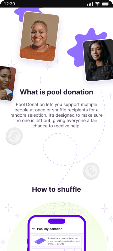
To support fairer giving, I added a pool donation option that lets donors support multiple recipients with one donation.
Rather than asking donors to choose just one person, they can select or enter a total amount, and the app distributes it evenly across recipients. This reduces decision pressure while giving less-visible profiles a better chance to receive support.
Results & Impact
Results & Impact
Results & Impact
The redesign improved the donation experience by making the flow clearer, more reassuring, and easier to complete.
• Reduced drop-off by 50% after the “select amount” step from MVP1 to MVP2
• Increased completed donations by 30% from amount selection to payment success
• 25% of donors viewed Impact or Voices of Gratitude before donating
• Introduced Pool Donation to help donors support multiple recipients more fairly
• Made checkout feel more trustworthy by clarifying fees, recipient, fund destination, and Stripe payment before users left the app
What I learned
What I learned
What I learned
This project taught me that reducing drop-off is not only about making a flow shorter. In donation products, trust, clarity, and emotional confidence matter just as much as usability.
I learned how to combine usage data, user interviews, founder workshops, and design testing to understand why users hesitate — then turn those insights into a giving experience that feels easier, fairer, and more human.